Django Development with Djblets

Django is an awesome development platform for web applications. With such features as database abstraction, template/view/url separation, built-in authentication with interchangeable backends, it’s made web development much more enjoyable.

We use Django in Review Board with much success. Over time, as we’ve come to develop new features, we realized that much of our codebase was useful outside of Review Board and, bit by bit, moved pieces into a library we call Djblets.

What does Djblets do?

A bit of everything, really. Any time we have useful functionality that isn’t tied to Review Board, we put it here.

Djblet’s feature list currently consists of:

  • Authentication improvements, making it easy to register and login in one step, seamlessly, handle password recovery, and more.
  • Flexible datagrids for displaying data in a paginated list with user-specific column customization, ordering and sorting.
  • Decorators to drastically simplify creation of simple and block template tags.
  • Caching functions for calling a function and caching the result if the data isn’t already in the cache, and a special URL pattern matcher that prevents caching of any contained URLs.
  • Unit testing utility classes.

And of course more little things here and there.

Downloading Djblets

Djblets is not a released app, but it’s pretty stable and well tested. You can check out a copy from our SVN repository, or automatically include it in your own repository through an svn:externals entry.

Djblets is licensed under the MIT license, making it usable in most projects.

Using Djblets

Over time I’ll be writing articles on using the many features of Djblets. See the other posts in the series, or dig around the Djblets source code.

Best Valentines card ever

I’m not a huge fan of Valentines Day in general, especially right now, but the card my little sister sent me made me smile.

Pirate Panda

Did you get a Pirate Panda for Valentines Day?

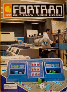
INPUT: REASON • OUTPUT: PLEASURE

I love ebay.

Fortran Board Game

I used to own this as a kid but it disappeared at some point. We recently found this on ebay and had to buy it for the office.

You’re an instruction pointer. Your board is a flowchart of sorts. First person to have the highest value in their register and reach the end wins.

Hell yes.

Dear Lazyweb: Shadows and Shaped Windows

I’ve been trying for a couple of days to figure out why a shaped window in Compiz doesn’t have a shadow. After looking through the Emerald and GTK+ decorators’ code, it seems that they only apply a shadow if the window has a titlebar decoration. This seems quite silly and limiting. Does anybody know of a way around this, or why we’re limited in such a way? Is this something that could be fixed?

Love,

Christian

Review Board: The Past 5 Months

It’s been about 5 months since I last gave a Review Board status update. Way too long, given how much has changed. So once again, let’s start off with a few stats.

  • Total bugs open: 25
  • Total bugs fixed: 186
  • Feature requests open: 43
  • Companies known to be using Review Board: at least 23

Review Board has matured in recent months and has a very nice feature set. More and more we’re seeing and hearing about companies using it in one or more teams. I was even lucky enough to talk about it in the official Django Book.

Development shows no sign of stalling. Our feature request list is a mile long, and our personal TODO lists are longer still. We’ve implemented so many new features and fixed so many bugs that I can’t even list them all, but let’s take a look at the highlights.

New Top-Level Features

  • iPhone support. Basic read-only iPhone support was added. It’s more of a proof of concept and to make sure our codebase handles different UIs on top of it, but if your Review Board server is accessible from your iPhone, point Safari to /iphone/ for some fun.
  • Status Reports. Basic support for status reports have been added. While we don’t have a fleshed out UI in place, the /reports/ URL will give you simple reports showing which review requests you’ve reviewed, and other bits of information. This can even be presented in Wiki format!

Revision Control Systems Integration

  • Mercurial support. One of our contributors has written support for doing review requests against Mercurial repositories. This supports local and remote repositories.
  • Git support. Basic Git support was written as well. It only works with local Git repositories (as it has to have access to .git directories).

Diff Viewer

  • Improved diff parser. We no longer require third party tools in order to parse diff files. We can do it ourselves faster and with greater flexibility. This has given us some speed advantages, reduced the hacks needed, and improved diff compatibility.
  • Interdiffs. Review Board can now display the differences between two revisions of a diff. This makes it much easier to review several iterations of large changes spanning many files.
  • Fixed diff line numbers. Line numbers in the diff viewer used to be artificial. They were essentially table row numbers. Now line numbers on the left-hand side of the diff viewer represent the actual line numbers in the original file, and line numbers on the right represent the new file.
  • “Review” link. Added a “Review” link on the diff viewer and screenshot page for bringing up the Review dialog. Previously users had to click a link on the diff viewer regardless of whether they were leaving a comment on the diff.

Reviews

  • Show commented screenshots on reviews. Portions of a screenshot that the user has commented on will appear in the review body, much like diff fragments do. This greatly improves the review process when it comes to screenshots.
  • Updated diffs create a new draft. Newly updated diffs used to instantly appear and send out an e-mail, which was annoying if you realized you needed to change and re-upload the diff again. Now updating the diff just creates a draft, if one doesn’t already exist. The diff won’t show up or spam users until you’re ready for it to.
  • Auto-completion for reviewers. The reviewer lists now have support for auto-completion of group names and usernames. As you’re typing, a list of choices based on the current text will appear. Navigating with the arrow keys or hitting Tab will auto-complete the selected entry.
  • Default reviewers. Administrators can now specify default reviewers for file paths (as defined by a regular expression). This allows certain groups to “own” files or paths and to be included on the reviewers list any time a diff touching those is uploaded.
  • Improved page banners. The draft banner at the top of the review request page has been improved and is now more clear. No longer do you have to save a draft and then publish it. It’s now one single button on the banner. We also added “discarded” and “submitted” banners.
  • Alpha-numeric bug numbers. Not all bug trackers use numeric-only bug identifiers. We now support alpha-numeric bug numbers.

Dashboard and Review Request Lists

  • Starred review requests and groups. Users can now “star” a review request they wish to keep track of in their dashboard. They’ll be placed on the CC list and see changes in the dashboard. Users can also star a group in order to add it to their “Watched Groups” list in the dashboard.
  • Toggle display of submitted review requests. The “All Review Requests” page can now filter out submitted review requests via a toggleable “Show/Hide Review Requests” link.
  • Customizable columns. The various lists pages and the dashboard now support customizable columns. There are non-default columns that can be added to the view to show extra data, and existing columns can be removed. If you prefer all dates to be relative or absolute, just add the right columns. Furthermore, columns can be reordered simply by dragging them into the desired order.
  • New dashboard column types:
    • New Updates. This column shows a speech bubble icon when new discussions have taken place on a review request since the user last visited it.
    • Ship It. This column makes it easy to see if anybody has marked the review request as “Ship It!”
    • Absolute/relative timestamps. Users wishing to see only relative or absolute timestamps in the dashboard can add the Last Updated/Posted Absolute or Relative timestamp columns.
    • Number of Reviews. Sometimes it’s handy to see how many reviews have been made to a review request. This column provides that number.
    • Starred. Allows users to star/unstar a review request or group. This is like adding yourself to a CC list.

post-review

  • Upload diffs from a revision range. --revision-range has been added to allow for uploading diffs from a range of revisions on the server. This is currently only implemented for SVN.
  • Specify a default summary. --summary has been added to provide a default summary for the review request.
  • Open a browser after uploading. --open has been added to open a browser to the new review request.

Distribution/Installation

  • make install. It’s now trivial to create a Review Board tarball or to install it on your system. We integrate with autoconf/automake to generate the Makefiles and sample/default configuration files. This brings us a giant step closer to putting out releases.

What’s Next?

We have several things in the works. A couple of the major highlights would be a search interface and support for 3rd party extensions to Review Board. Stay tuned!

Working outside the box with Unity

A Brief History of Boxes

In the days of old, working on your computer meant working inside a limited contained box. You could run programs but only one at a time, because running two at the same time would require two computers. This was the status quo for years. It’s just how computers worked.

Then a new technology changed everything. Multitasking. Now you could buy one computer and your operating system would allow you to run multiple programs at once. No longer were you tied to one box at a time. You could have one for your word processor, one for your spreadsheet, and one for solitaire. It was a spectacular invention, one that we quickly took for granted. Relatively few computer users today even know what it’s like to use a computer without this ability.

As time went on, new operating systems began to develop substantial user bases. The competition between them grew, and most applications were tied to a particular operating system. You were limited to one operating system at a time, and if you wanted to run two at once you would need two computers.

Then came modern virtualization, which shattered this barrier. Now you could have one or more giant boxes on your computer containing a full operating system, each with different applications running. These boxes could sit side by side. Some people are already taking it for granted. Soon grade school children will be using virtualization without even knowing that there was a world before it.

But up until now, working in a virtualized environment meant working in a big box on your screen. Sure you could have several going at once, but you realistically could only interact with one at a time. These boxes represented screens, and you can only fit so many screens on a single screen at once before you start feeling really cramped.

Shattering the box

Earlier this year, we released VMware Fusion 1.0 for the Macintosh. This was our first virtualization product for the Mac and it has been met with high praise. And jealousy. VMware Fusion managed to change how users thought about virtualization. Thanks to Unity, you were no longer forced into having a big box on your screen. With the click of a button, the applications inside your virtual machine would appear outside of the box, sitting alongside your other applications. The Mac users loved this and Windows and Linux users were left feeling like they missed out.

I can’t recall how many times I’ve been asked if Workstation is going to include Unity in Workstation.

Unity
The answer is yes. Well, eventually.

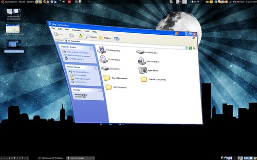
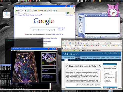
I’m working on adding Unity support to the Linux codebase, which may in time be part of Workstation or Player. This will allow your Windows and Linux programs to intermingle with the click of a button. As of right now, here are the current state of things:

Unity Today

Unity today works in Linux on my system. It’s known to work in Metacity but hasn’t been thoroughly tested in other window managers yet. The basic things you’d expect all work for the most part. The rest will come later.

What I have working today

So far, the very basic window management works today, for the most part. It’s usable just enough to go “Oh neat” and to play a game of solitaire.

Many things do not work today, though.

  • Virtual desktops do not work. If you move windows to other desktops, you’ll have problems.
  • Multiple monitors might work but probably won’t.
  • Alt-dragging or otherwise moving a window in a way other than by using the titlebar will cause us to get out of sync.
  • If you attempt to drag a window off-screen, the window manager may block it, but the events will still be sent to the guest. This could cause the window to get “stuck.”
  • Minimizing a window using the taskbar may cause visual oddities.
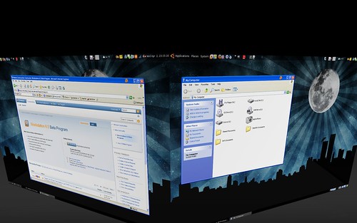
  • Partially obscured windows may look wrong when in Compiz’s Expose mode or similar modes where all windows are displayed at once.
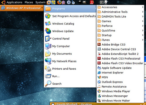
  • There’s no proper start menu integration. Exit Unity mode to launch new applications or press the Windows key or Control-escape while in a guest application to bring up the guest start menu.

These issues are being addressed. In many cases where windows become “stuck,” simply leaving Unity and then going back into it should fix the problem.

Going forward…

There’s a lot we have in the works for Unity, and while I cannot yet talk about it all, the end result should be just awesome. I’m hoping to have a video demoing it at some point.

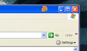
P.S. For those who notice the borders and VMware logo badges on the Windows windows in the screenshot and find them annoying, you will be able to disable them. The idea is to allow you to easily determine the guest windows from the host windows when the OS and theme are the same.

Sad Rainbow Plasma TV

I may soon be adding my plasma TV to the list of broken things, I fear. I came back from vacation last night after a week and now twice while watching TV, the screen has turned all rainbowy for about 2 seconds. This has never happened before and I’m hoping I don’t see it again. But I know better.

Anybody else experience this, specifically with Panasonic plasma TVs?

Everything breaks :(

So.. My Wii stopped reading discs. Just as I came home with Mario Galaxy. It makes some pretty sad clicking noises and then informs me that I should join in on its sadness.

I can’t say I’m at all surprised. I’m pretty good to my electronics. They just don’t return the favor. Let’s take a journey through the past.

  • 11 dead Palm PDAs (one right after the other until I got one that worked).
  • 7 dead harddrives in the past four years (latest 2 months ago).
  • Various fan problems, motherboard problems, display problems and keyboard problems across two different ThinkPads in the past two years.
  • 2 dead motherboards on two desktop computer (both mid-2006).
  • 1 dead LCD (a few months ago).
  • 1 dead DVD player (just a few months ago).
  • 1 dead MP3 player (just gave out one day).
  • 1 dead UPS (earlier this year, just stopped one day).
  • 1 dead car radio (a few months ago, just weeks after buying the car, which has always been in great condition).
  • 1 defective gear shift brake circuit (same car, couple weeks after the radio).
  • 1 dead Wii.

There’s more. I just can’t remember off-hand. Either the quality of everything sucks these days or anything electronic just commits suicide in my presence. I’m not sure which.

Vista: Windows ME’s Successor

(Apologies if this seems a bit ranty, but it is a rant, so…)

About a month ago, I decided to buy a new computer to use as a home theater PC and backup file server. I opted for a Shuttle, and with it came Windows Vista Ultimate. I had already used Vista a little bit at this point, but not on a day-to-day basis, so I decided I would give it a chance.

It’s a month later and I’m ready to wipe the partition. Vista is Microsoft’s latest greatest failure. Not since Windows ME have I seen an operating system cause so many problems.

Crashing Applications

Let’s start from the base case: Running your applications. Sure a lot of third party programs are marked as being incompatible, but would you expect your device manager or notepad.exe to run without problems? You might be wrong. It turns out a lot of people, myself included, experience crashes in several pre-installed and third party applications. Sometimes it’s while you’re using it, but often just quitting the program causes Vista to think it has crashed.

This makes for an unusable operating system. I have no idea if the program I’m about to run will survive more than a few minutes. The computer is essentially useless, and there’s nothing I can do about it, aside from installing another OS. Now, maybe Service Pack 1 will fix this problem, but it never should have been a problem in the first place. Extensive testing should have caught this. At the very least, my manufacturer should have seen this and never shipped Vista with this problem.

Vista UAC

The Vista UAC, or User Account Control, is Microsoft’s answer to the security problems that plagued previous versions of Windows. It’s brilliant in that it creates an excellent illusion of security, aggressively prompting the user for any action involving the system.

The main problem with UAC, though, is that the user is being bombarded with dialogs. Now, think about what happens when you encounter a dialog. Often times, you don’t read it, you assume what it’s saying, especially if you’ve encountered it before. I know of several non-techy people who blindly click dialogs, and that’s where UAC falls apart. There could be a virus on the system and the user, having had to click through these dialogs time and time again, may not realize that this virus-activated UAC dialog was not caused by their own actions and click through it.

Some people have no idea what goes on in a computer and assume that if the system needs to do something, there must be a good reason for it. Since the UAC dialogs are a bit cryptic at times, I can see users thinking, “My computer wants to do this, it must have a good reason for it!” and proceeding to allow the operation.

The UAC dialogs are also pretty verbose. If you perform a file operation in a system directory, you’ll get 3 confirmation dialogs. The first to confirm you want to do this in a system area, a second to ask if you want to go to the admin confirmation screen (why, I have no idea), and a third to confirm that the whole operation is allowed.

Now, think about when you create a directory. You’re performing two file operations. First, the initial creation of the directory and second, renaming the directory based on the name you gave it. This common operation will punish you with six dialogs!

</rant>

There’s more I could say but I won’t. I’m really looking forward to Vista SP1 with the hope that it will fix a lot of these problems, because as of right now, this is a really unstable, frustrating OS. I think it has potential if they can get these problems sorted out, though.

Scroll to Top