Python offers a handy module called pprint, which has helpers for formatting and printing data in a nicely-formatted way. If you haven’t used this, you should definitely explore it!
Most people will reach for this module when using pprint.pprint() (aka pprint.pp()) or pprint.pformat(), but one under-appreciated method is pprint.saferepr(), which advertises itself as returning a string representation of an object that is safe from some recursion issues. They demonstrate this as:
>>>import pprint>>> stuff =['spam','eggs','lumberjack','knights','ni']>>> stuff.insert(0, stuff)>>> pprint.saferepr(stuff)"[<Recursion on list with id=4370731904>, 'spam', 'eggs', 'lumberjack', 'knights', 'ni']"
But actually repr() handles this specific case just fine:
Pretty minimal difference there. Is there another reason we might care about saferepr()?
Dictionary string comparisons!
saferepr() first sets up the pprint pretty-printing machinery, meaning it takes care of things like sorting keys in dictionaries.
This is great! This is really handy when writing unit tests that need to compare, say, logging of data.
See, modern versions of CPython 3 will preserve insertion order of keys into dictionaries, which can be nice but aren’t always great for comparison purposes. If you’re writing a unit test, you probably want to feel confident about the string you’re comparing against.
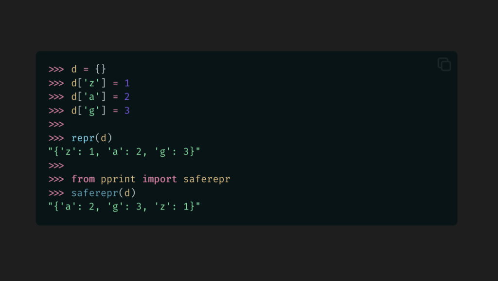
Let’s take a look at repr() vs. saferepr() with a basic dictionary.
A nice, stable order. Now we don’t have to worry about a unit test breaking on different versions or implementations or with different logic.
saferepr() will disable some of pprint()`’s typical output limitations. There’s no max dictionary depth. There’s no max line width. You just get a nice, normalized string of data for comparison purposes.
But not for sets…
Okay, it’s not perfect. Sets will still use their standard representation (which seems to be iteration order), and this might be surprising given how dictionaries are handled.
Interestingly, pprint() and pformat()will sort keys if it needs to break them across multiple lines, but otherwise, nope.
With this, you can set a style or a CSS variable based on some condition, like whether the device is on a touchscreen, or whether some CSS property is supported, or even based on an attribute on an element.
It’s really cool, and sooner or later we’ll all be (ab)using it.
Actually, you can pretty much do this today using CSS Variables, with a little understanding of how variable fallbacks work and how you can use this to make your own conditionals.
What are CSS Variables?
CSS Variables make it easy to use reuse colors and styles across a CSS codebase. At their most basic, they look like this:
CSS Variables can have fallbacks, which falls back to some other value if the variable isn’t defined. Here, the color will be black if --my-custom-fg-color wasn’t defined in the scope.
body {color:var(--my-custom-fg-color,black);}
This can be nested with other CSS variables:
body {color:var(--my-custom-fg-color,var(--my-fg-color,black));}
Fallbacks depend on whether the variable is truthy or falsy.
Truthy and Falsy Variables
When a variable is falsy, var() will use the fallback value.
When it is truthy, the fallback value won’t be used.
Normally, it’s falsy if the variable isn’t defined, and truthy if it is. But there are a couple tricks to know about:
You can make a variable falsy by setting it to the special keyword initial.
You can make a variable truthy (without expanding to a value) by making the value empty.
Let me show you what I mean:
:root {/* Empty -- Truthy and a no-op */ --no-fallback:;/* 'initial' -- Falsy, use fallback */ --use-fallback:initial;}body {background:var(--no-fallback,grey);color:var(--use-fallback,blue);}
This will result in the following CSS:
body {background:;/* No value -- ignored. */color:blue;}
Our new --use-fallback will ensure the fallback value will be used, and --no-fallback will ensure it’s never used (but won’t leave behind a value).
These are our core building blocks for conditional CSS Variables.
We can then combine these rules.
body {background:var(--no-fallback,red)var(--use-fallback,pink);color:var(--no-fallback,pink)var(--use-fallback,red);}
This will give us:
body {background:pink;color:red;}
Behold:
You can play around with it here:
Armed with this knowledge, we can now start setting CSS Variables based on other state, and trigger the conditions.
Setting Conditional Variables
Let’s set up another contrived example. We’re going to put together some HTML with a button that styles differently based on where it’s placed. In this case, when in <main>, it will appear blue-on-pink and elsewhere it’ll appear pink-on-blue.
It’s my post and I will use hideous color palettes if I want to.
We’re going to set up some conditional state variables based on the main placement. (Yep, contrived example, but this is just for demonstration purposes.)
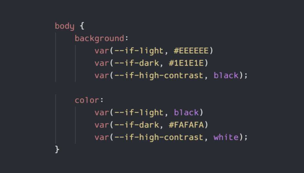
But now we can’t give users a nice toggle on the page to control their light/dark modes, so we’ll want to bring the CSS classes back with the media selectors:
Now let’s use all that to style <body> and <button>:
body {background:var(--if-light,orange)var(--if-dark,darkorange);color:var(--if-light,darkgreen)var(--if-dark,blue);}button {background:var(--if-light,pink)var(--if-dark,blue);color:var(--if-light,blue)var(--if-dark,pink);}
Look at that. So much simpler to maintain. And we can extend that too, if we want to add high-constrast mode or something.
Let’s test it.
Here it is when we switch our system to dark mode:
Far less eye strain than light. I’m sold.
Now light mode:
And system dark mode with <html class="is-light"> overriding to light mode.
And system light mode with <html class="is-dark"> overriding to dark mode.
Perfection.
You can play with that one here:
Nesting Conditionals!
That’s right, you can nest them! Let’s update our Light/Dark Mode example to make a prettier color scheme, because I’m starting to realize what we had was kind of ugly.
We’ll define new --if-pretty and --if-ugly states to go along with --if-dark and --if-light:
And now we can build some truly beautiful styling, using nested conditionals:
body {background:var(--if-pretty,var(--if-light,linear-gradient( in hsl longer hue45deg,red0100%) ) )var(--if-dark,blacklinear-gradient( in hsl longer hue45deg,rgba(255,0,0,20%) 0100%) ) ) ) var(--if-ugly, var(--if-light, orange) var(--if-dark, darkorange) );color:var(--if-pretty,var(--if-light,black)var(--if-dark,white) )var(--if-ugly,var(--if-light,darkgreen)var(--if-dark,blue) );font-size:100%;}button {background:var(--if-pretty,radial-gradient(ellipseattop,orange,transparent ),radial-gradient(ellipseatbottom,orange,transparent ) )var(--if-ugly,var(--if-light,pink)var(--if-dark,blue) );color:var(--if-pretty,black)var(--if-ugly,var(--if-light,blue)var(--if-dark,pink) );}
In standard Ugly Mode, this looks the same as before, but when we apply Pretty Mode with Light Mode, we get:
And then with Dark Mode:
I am available for design consulting work on a first-come, first-serve basis only.
Here it is so you can enjoy it yourself:
A Backport from If()
Google’s article on if() has a neat demo showing how you can style some cards based on the value of a data-status= attribute. Based on whether the value is pending, complete, or anything else, the cards will be placed in different columns and have different background and border colors.
Here’s the card:
<divclass="card"data-status="complete"> ...</div>
Here’s how you’d do that with if() (from their demo):
You can use this today in all browsers that support CSS Variables. That’s.. counts.. years worth of browsers.
It requires a bit more work to set up the variables, but the nice thing is, once you’ve done that, the rest is highly maintainable. And usage is close enough to that of if() that you can more easily transition once support is widespread.
We’ve based Ink, our (still very young) CSS component library we use for Review Board, around this conditionals pattern. It’s helped us to support light and dark modes along with the beginnings of low- and high-contrast modes and state for some components without tearing our hair out.
Give it a try, play with the demos, and see if it’s a good fit for your codebase. Begin taking advantage of what if() has to offer today, so you can more easily port tomorrow.
I’ve been doing some work on Review Board and our utility library Typelets, and thought I’d share some of the intricacies of function signatures and their typing in Python.
We have some pretty neat Python typing utilities in the works to help a function inherit another function’s types in their own *args and **kwargs without rewriting a TypedDict. Useful for functions that need to forward arguments to another function. I’ll talk more about that later, but understanding how it works first requires understanding a bit about how Python sees functions.
Function signatures
Python’s inspect module is full of goodies for analyzing objects and code, and today we’ll explore the inspect.signature() function.
inspect.signature() is used to introspect the signature of another function, showing its parameters, default values, type annotations, and more. It can also aid IDEs in understanding a function signature. If a function has __signature__ defined, it will reference this (at least in CPython), and this gives highly-dynamic code the ability to patch signatures at runtime. (If you’re curious, here’s exactly how it works).
There are a few places where knowing the signature can be useful, such as:
Automatically-crafting documentation (Sphinx does this)
Checking if a callback handler accepts the right arguments
Checking if an implementation of an interface is using deprecated function signatures
Let’s set up a function and take a look at its signature.
If you guessed it wouldn’t have cls, you’d be right.
Only unbound methods (definitions of methods on a class) will have a self parameter in the signature. Bound methods (callable methods bound to an instance of a class) and classmethods (callable methods bound to a class) don’t. And this makes sense, if you think about it, because this signature represents what the call accepts, not what the code defining the method looks like.
You don’t pass a self when calling a method on an object, or a cls when calling a classmethod, so it doesn’t appear in the function signature. But did you know that you can call an unbound method if you provide an object as the self parameter? Watch this:
In this case, the unbound method MyClass.my_method has a self argument in its signature, meaning it takes it in a call. So, we can just pass in an instance. There aren’t a lot of cases where you’d want to go this route, but it’s helpful to know how this works.
What are bound and unbound methods?
I briefly touched upon this, but:
Unbound methods are just functions. Functions that are defined on a class.
Bound methods are a function where the very first argument (self or cls) is bound to a value.
>>>defmy_func(self):...print('I am',self)...>>>classMyClass:.........>>> obj =MyClass()>>> method = my_func.__get__(MyClass)>>> method<bound method my_func of <__main__.MyClass object at 0x100ea20d0>>>>> method.__self__<__main__.MyClass object at 0x100ea20d0>>>> inspect.ismethod(method)True>>>method()I am <__main__.MyClass object at 0x100ea20d0>
my_func wasn’t even defined on a class, and yet we could still make it a bound method tied to an instance of MyClass.
You can think of a bound method as a convenience over having to pass in an object as the first parameter every time you want to call the function. As we saw above, we can do exactly that, if we pass it to the unbound method, but binding saves us from doing this every time.
You’ll probably never need to do this trick yourself, but it’s helpful to know how it all ties together.
By the way, @staticmethod is a way of telling Python to never make an unbound method into a bound method when instantiating the object (it stays a function), and @classmethod is a way of telling Python to bind it immediately to the class it’s defined on (and not rebind when instantiating an object from the class).
How do you tell them apart?
If you have a function, and you don’t know if it’s a standard function, a classmethod, a bound method, or an unbound method, how can you tell?
Bound methods have a __self__ attribute pointing to the parent object (and inspect.ismethod() will be True).
Classmethods have a __self__ attribute pointing to the parent class (and inspect.ismethod() will be True).
They might have a self or cls parameter in the signature, but they might not have those names (and other functions may define them).
They should have a . in its __qualname__ attribute. This is a full .-based path to the method, relative to the module.
Splitting __qualname__, the last component would be the name. The previous component won’t be <locals> (but if <locals> is found, you’re going to have trouble getting to the method).
If the full path is resolvable, the parent component should be a class (but it might not be).
You could… resolve the parent module to a file and walk its AST and find the class and method based on __qualname__. But this is expensive and probably a bad idea for most cases.
Standard functions are the fallback.
Since unbound methods are standard functions that are just defined on a class, it’s difficult to really tell the difference. You’d have to rely on heuristics and know you won’t always get a definitive answer.
(Interesting note: In Python 2, unbound methods were special kinds of functions with a __self__ that pointed to the class they were defined on, so you could easily tell!)
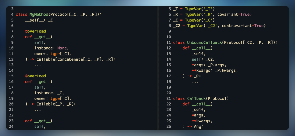
This is very simplistic, and can’t be used to represent positional-only arguments, keyword-only arguments, default arguments, *args, or **kwargs. For that, you can define a Protocol with __call__:
from typing import ProtocolclassMyCallback(Protocol):def__call__(self,# This won't be part of the function signaturea:int,b:str,/,c: dict[str,str]|None,*,d:bool=False,**kwargs,)->str:...
Type checkers will then treat this as a Callable, effectively. If we take my_func from the top of this post, we can assign to it:
cb: MyCallback = my_func # This works
What if we want to assign a method from a class? Let’s try bound and unbound.
classMyClass:defmy_func(self,a:int,b:str,/,c: dict[str,str]|None,*,d:bool=False,**kwargs,)->str:return'42'cb2: MyCallback = MyClass.my_func # This failscb3: MyCallback =MyClass().my_func # This works
What happened? It’s that self again. Remember, the unbound method has self in the signature, and the bound method does not.
Let’s add self and try again.
classMyCallback(Protocol):def__call__(_proto_self,# This won't be part of the function signatureself: Any,a:int,b:str,/,c: dict[str,str]|None,*,d:bool=False,**kwargs,)->str:...cb2: MyCallback = MyClass.my_func # This workscb3: MyCallback =MyClass().my_func # This fails
What happened this time?! Well, now we’ve matched the unbound signature with self, but not the bound signature without it.
Solving this gets… verbose. We can create two versions of this: Unbound, and Bound (or plain function, or classmethod):
classMyUnboundCallback(Protocol):def__call__(_proto_self,# This won't be part of the function signatureself: Any,a:int,b:str,/,c: dict[str,str]|None,*,d:bool=False,**kwargs,)->str:...classMyCallback(Protocol):def__call__(_proto_self,# This won't be part of the function signaturea:int,b:str,/,c: dict[str,str]|None,*,d:bool=False,**kwargs,)->str:...# These workcb4: MyCallback = my_funccb5: MyCallback =MyClass().my_func# These fail correctlycb7: MyUnboundCallback = my_funccb8: MyUnboundCallback =MyClass().my_funccb9: MyCallback = MyClass.my_func
This means we can use union types (MyUnboundCallback | MyCallback) to cover our bases.
It’s not flawless. Depending on how you’ve typed your signature, and the signature of the function you’re setting, you might not get the behavior you want or expect. As an example, any method with a leading self-like parameter (basically any parameter coming before your defined signature) will type as MyUnboundCallback, because it might be! Remember, we can turn any function into a bound method for an arbitrary class using __get__. That may or may not matter, depending on what you need to do.
What do I mean by that?
defmy_bindable_func(x,a:int,b:str,/,c: dict[str,str]|None,*,d:bool=False,**kwargs,)->str:return''x1: MyCallback = my_bindable_func # This failsx2: MyUnboundCallback = my_bindable_func # This works
x may not be named self, but it’ll get treated as one, because if we do my_bindable_func.__get__(some_obj), then some_obj will be bound to x and callers won’t have to pass anything to x.
Okay, what if you want to return a function that can behave as an unbound method (with self) that can become an unbound method (with __get__)? We can mostly do it with:
And those are type-compatible with the MyCallback and MyUnboundCallback we built earlier, since the signatures match:
# These workcb10: MyUnboundCallback = MyClass.my_methodcb11: MyCallback =MyClass().my_method# These fail correctlycb12: MyUnboundCallback =MyClass().my_methodcb13: MyCallback = MyClass.my_method
And if we wanted, we could modify that ParamSpec going into the MyMethod from make_method() and that’ll impact what the type checkers expect during the call.
Hopefully you can see how this can get complex fast, and involve some tradeoffs.
I personally believe Python needs a lot more love in this area. Types for the different kinds of functions/methods, better specialization for Callable, and some of the useful capabilities from TypeScript would be nice (such as Parameters<T>, ReturnType<T>, OmitThisParameter<T>, etc.). But this is what we have to work with today.
My teachers said to always write a conclusion
What have we learned?
Python’s method signatures are different when bound vs. unbound, and this can affect typing.
Unbound methods aren’t really their own thing, and this can lead to some challenges.
Any method can be a bound method with a call to __get__().
Callable only gets you so far. If you want to type complex functions, write a Protocol with a __call__() signature.
If you want to simulate a bound/unbound-aware type, you’ll need Protocol with __get__().
I feel like I just barely scratched the surface here. There’s a lot more to functions, working with signatures, and challenges around typing than I covered here. We haven’t talked about how you can rewrite signatures on the fly, how annotations are represented, what functions look under the hood, or how bytecode behind functions are mutable at runtime.
I’ll leave some of that for future posts. And I’ll have more to talk about when we expand Typelets with the new parameter inheritance capabilities. It builds upon a lot of what I covered today to perform some very neat and practical tricks for library authors and larger codebases.
What do you think? Did you learn something? Did I get something wrong? Have you done anything interesting or unexpected with signatures or typing around functions you’d like to share? I want to hear about it!
Python dataclasses are a really nice feature for constructing classes that primarily hold or work with data. They can be a good alternative to using dictionaries, since they allow you to add methods, dynamic properties, and subclasses. They can also be a good alternative to building your own class by hand, since they don’t need a custom __init__() that reassigns attributes and provide methods like __eq__() out of the box.
One small tip to keeping dataclasses maintainable is to always construct them with kw_only=True, like so:
from dataclasses import dataclass


@dataclass(kw_only=True)
class MyDataClass:
    x: int
    y: str
    z: bool = True
This will construct an __init__() that looks like this:
class MyDataClass:
    def __init__(
        self,
        *,
        x: int,
        y: str,
        z: bool = True,
    ) -> None:
        self.x = x
        self.y = y
        self.z = z
Instead of:
class MyDataClass:
    def __init__(
        self,
        x: int,
        y: str,
        z: bool = True,
    ) -> None:
        self.x = x
        self.y = y
        self.z = z
That * in the argument list means everything that follows must be passed as a keyword argument, instead of a positional argument.
There are two reasons you probably want to do this:
It allows you to reorder the fields on the dataclass without breaking callers. Positional arguments means a caller can use MyDataClass(1, 'foo', False), and if you remove/reorder any of these arguments, you’ll break those callers unexpectedly. By forcing callers to use MyDataClass(x=1, y='foo', z=False), you remove this risk.
It allows subclasses to add required fields. Normally, any field with a default value (like z above) will force any fields following it to also have a default. And that includes all fields defined by subclasses. Using kw_only=True gives subclasses the flexibility to decide for themselves which fields must be provided by the caller and which have a default.
These reasons are more important for library authors than anything. We spend a lot of time trying to ensure backwards-compatibility and forwards-extensibility in Review Board, so this is an important topic for us. And if you’re developing something reusable with dataclasses, it might be for you, too.
Update: One important point I left out is Python compatibility. This flag was introduced in Python 3.10, so if you’re supporting older versions, you won’t be able to use this just yet. If you want to optimistically enable this just on 3.10+, one approach would be:
import sys
from dataclasses import dataclass


if sys.version_info[:2] >= (3, 10):
    dataclass_kwargs = {
        'kw_only': True,
    }
else:
    dataclass_kwargs = {}

...

@dataclass(**dataclass_kwargs)
class MyDataClass:
    ...
...
But this won’t solve the subclassing issue, so you’d still need to ensure any subclasses use default arguments if you want to support versions prior to 3.10.
For years I’ve wanted spell checking in CodeMirror. We use CodeMirror in our Review Board code review tool for all text input, in order to allow on-the-fly syntax highlighting of code, inline image display, bold/italic, code literals, etc.
(We’re using CodeMirror v5, rather than v6, due to the years’ worth of useful plugins and the custom extensions we’ve built upon it. CodeMirror v6 is a different beast. You should check it out, but we’re going to be using v5 for our examples here. Much of this can likely be leveraged for other editing components as well.)
CodeMirror is a great component for the web, and I have a ton of respect for the project, but its lack of spell checking has always been a complaint for our users.
And the reason for that problem lies mostly on the browsers and “standards.” Starting with…
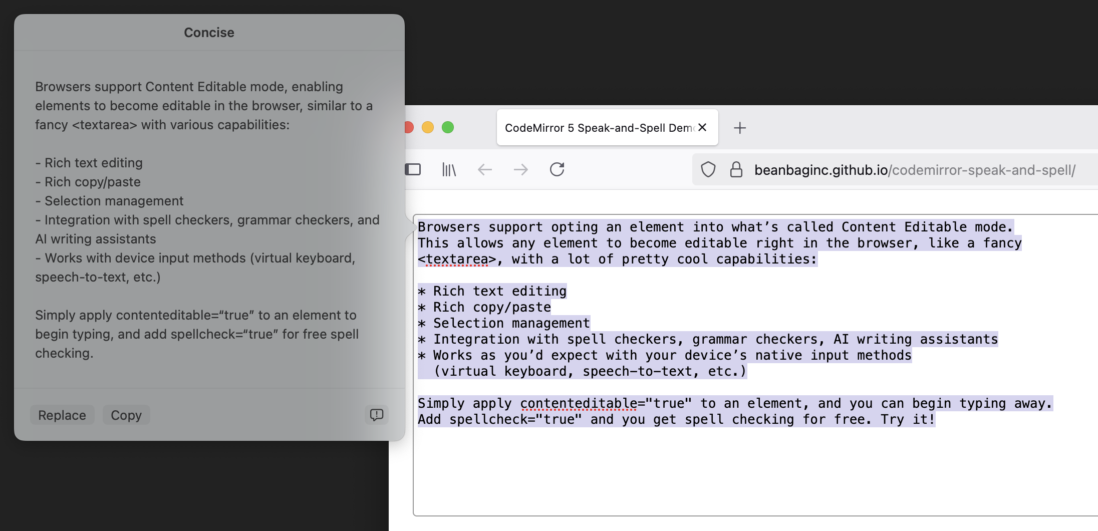
ContentEditable Mode
Browsers support opting an element into what’s called Content Editable mode. This allows any element to become editable right in the browser, like a fancy <textarea>, with a lot of pretty cool capabilities:
Rich text editing
Rich copy/paste
Selection management
Integration with spell checkers, grammar checkers, AI writing assistants
Works as you’d expect with your device’s native input methods (virtual keyboard, speech-to-text, etc.)
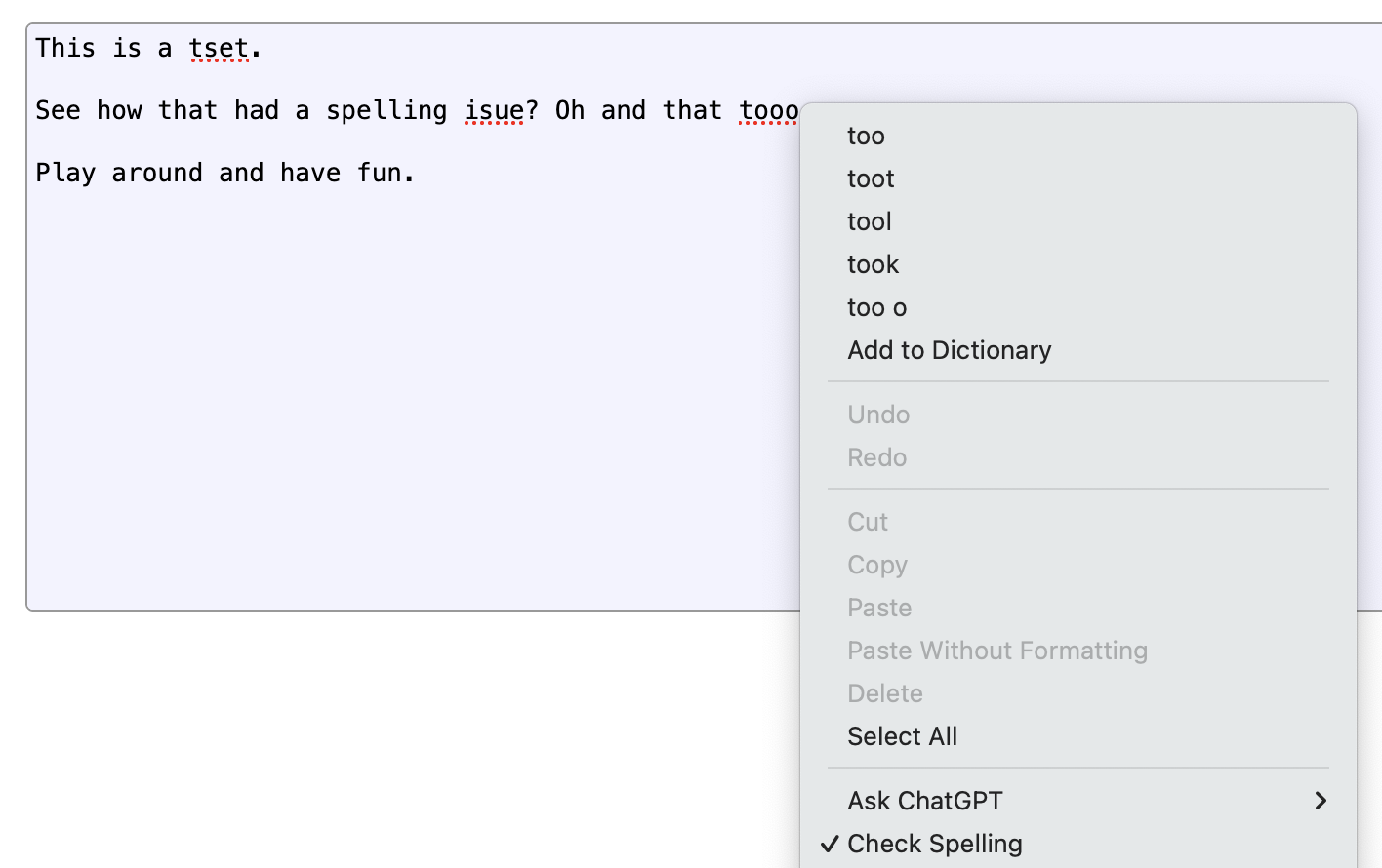
Simply apply contenteditable="true" to an element, and you can begin typing away. Add spellcheck="true" and you get spell checking for free. Try it!
And maybe you don’t even need spellcheck="true"! The browser may just turn it on automatically. But you may need spellcheck="false" if you don’t want it on. And it might stay on anyway!
Here we reach the first of many inconsistencies. Content Editable mode is complex and not perfectly consistent across browsers (though it’s gotten better). A few things you might run into include:
Ranges for selection events and input events can be inconsistent across browsers and are full of edge cases (you’ll be doing a lot of “let me walk the DOM and count characters carefully to find out where this selection really starts” checks).
Spell checking behaves quite differently on different browsers (especially in Chrome and Safari, which might recognize a word as misspelled but won’t always show it).
Rich copy/paste may mess with your DOM structure in ways you don’t expect.
Programmatic manipulating of the text content using execCommand is deprecated with no suitable replacement (and you don’t want to mess with the DOM directly or you break Undo/Redo). It also doesn’t always play nice with input events.
CodeMirror v5 tries to let the browser do its thing and sync state back, but this doesn’t always work. Replacing misspelled words on Safari or Chrome can sometimes cause text to flip back-and-forth. Data can be lost. Cursor positions can change. It can be a mess.
So while CodeMirror will let you enable both Content Editable and Spell Checking modes, it’s at your own peril.
Which is why we never enabled it.
How do we fix this?
When CodeMirror v5 was introduced, there weren’t a lot of options. But browsers have improved since.
There are a lot of operations that can involve placing new text in a Content Editable:
Replacing a misspelled word
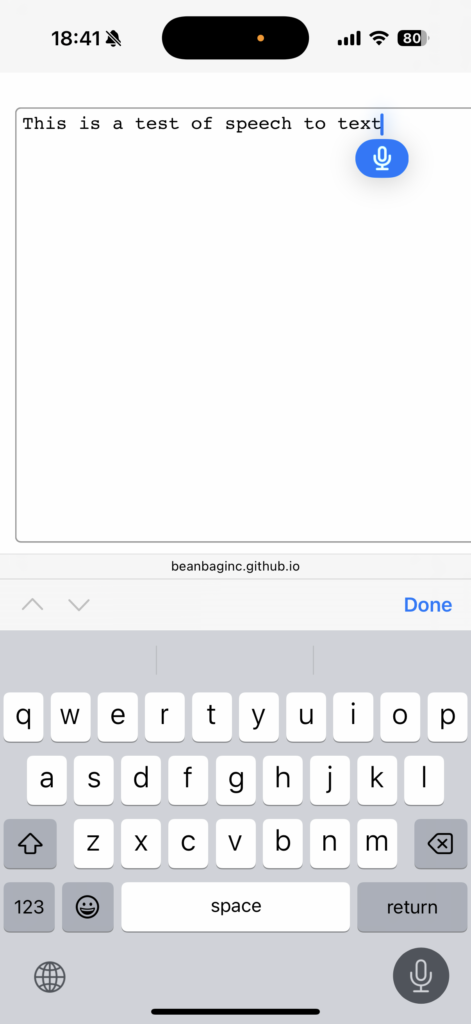
Using speech-to-text
Having AI generate content or rewrite existing content
Transforming text to Title Case
These will generate a beforeinput event before making the change, and an input event after making the change.
Both events provide:
The type of operation:
insertText for text-to-speech or newly-generated text
insertReplacementText for spelling replacements, AI rewrites, and other similar operations
The range of text being replaced (or where new text will be inserted)
The new data (either as InputEvent.data in the form of one or more InputEvent.dataTransferItem.items[] entries)
Thankfully, beforeinput can be canceled, which prevents the operation from going through.
This is our way in. We can treat these operations as requests that CodeMirror can fulfill, instead of changes CodeMirror must react to.
Putting our plan into action
Here’s the general approach:
Listen to beforeinput on CodeMirror’s input element (codemirror.display.input.div).
Filter for the following InputEvent.inputType values: 'insertReplacementText', 'insertText'.
Fetch the ranges and the new plain text data from the InputEvent.
For each range:
Convert each range into a start/end line number within CodeMirror, and a start/end within each line.
Issue a CodeMirror.replaceRange() with the normalized ranges and the new text.
Simple in theory, but there’s a few things to get right:
Different browsers and different operations will report those ranges on different elements. They might be text nodes, they might be a parent element, or they might be the top-level contenteditable element. Or a combination. So we need to be very careful about our assumptions.
We need to be able to calculate those line numbers and offsets. We won’t necessarily have that information up-front, and it depends on what nodes we get in the ranges.
The text data can come from more than one place:
An InputEvent.data attribute value
One or more strings accessed asynchronously from InputEvent.dataTransfer.items[], in plain text, HTML, or potentially other forms.
We may not have all of this! Even as recently as late-2024, Chrome wasn’t giving me target ranges in beforeinput, only in input, which was too late. So we’ll want to bail if anything goes wrong.
Let’s put this into practice. I’ll use TypeScript to help make some of this a bit more clear, but you can do all this in JavaScript.
Feel free to skip to the end, if you don’t want to read a couple pages of TypeScript.
1. Set up our event handler
We’re going to listen to beforeinput. If it’s an event we care about, we’ll grab the target ranges, take over from the browser (by canceling the event), and then prepare to replay the operation using CodeMirror’s API.
This is going to require a bit of help figuring out what lines and columns those ranges correspond to, which we’ll tackle next.
const inputEl = codeMirror.display.input.div;

inputEl.addEventListener('beforeinput',
                         (evt: InputEvent) => {
    if (evt.inputType !== 'insertReplacementText' &&
        evt.inputType !== 'insertText') {
        /*
         * This isn't a text replacement or new text event,
         * so we'll want to let the browser handle this.
         *
         * We could just preventDefault()/stopPropagation()
         * if we really wanted to play it safe.
         */
        return;
    }

    /*
     * Grab the ranges from the event. This might be
     * empty, which would have been the case on some
     * versions of Chrome I tested with before. Play it
     * safe, bail if we can't find a range.
     *
     * Each range will have an offset in a start container
     * and an offset in an end container. These containers
     * may be text nodes or some parent node (up to and
     * including inputEl).
     */
    const ranges = evt.getTargetRanges();

    if (!ranges || ranges.length === 0) {
        /* We got empty ranges. There's nothing to do. */
        return;
    }

    const newText =
           evt.data
        ?? evt.dataTransfer?.getData('text')
        ?? null;

	if (newText === null) {
		/* We couldn't locate any text, so bail. */
        return;
	}

    /*
     * We'll take over from here. We don't want the browser
     * messing with any state and impacting CodeMirror.
     * Instead, we'll run the operations through CodeMirror.
     */
    evt.preventDefault();
    evt.stopPropagation();

    /*
     * Place the new text in CodeMirror.
     *
     * For each range, we're getting offsets CodeMirror
     * can understand and then we're placing text there.
     *
     * findOffsetsForRange() is where a lot of magic
     * happens.
     */
    for (const range of state.ranges) {
        const [startOffset, endOffset] =
            findOffsetsForRange(range);

        codeMirror.replaceRange(
            newText,
            startOffset,
            endOffset,
            '+input',
        );
    }
});
This is pretty easy, and applicable to more than CodeMirror. But now we’ll get into some of the nitty-gritty.
2. Map from ranges to CodeMirror positions
Most of the hard work really comes from mapping the event’s ranges to CodeMirror line numbers and columns.
We need to know the following:
Where each container node is in the document, for each end of the range.
What line number each corresponds to.
What the character offset is within that line.
This ultimately means a lot of traversing of the DOM (we can use TreeWalker for that) and counting characters. DOM traversal is an expense we want to incur as little as possible, so if we’re working on the same nodes for both end of the range, we’ll just calculate it once.
function findOffsetsForRange(
    range: StaticRange,
): [CodeMirror.Position, CodeMirror.Position] {
    /*
     * First, pull out the nodes and the nearest elements
     * from the ranges.
     *
     * The nodes may be text nodes, in which case we'll
     * need their parent for document traversal.
     */
    const startNode = range.startContainer;
    const endNode = range.endContainer;

    const startEl = (
        (startNode.nodeType === Node.ELEMENT_NODE)
        ? startNode as HTMLElement
        : startNode.parentElement);
    const endEl = (
        (endNode.nodeType === Node.ELEMENT_NODE)
        ? endNode as HTMLElement
        : endNode.parentElement);

    /*
     * Begin tracking the state we'll want to return or
     * use in future computations.
     *
     * In the optimal case, we'll be calculating some of
     * this only once and then reusing it.
     */
    let startLineNum = null;
    let endLineNum = null;
    let startOffsetBase = null;
    let startOffsetExtra = null;
    let endOffsetBase = null;
    let endOffsetExtra = null;

    let startCMLineEl: HTMLElement = null;
    let endCMLineEl: HTMLElement = null;

    /*
     * For both ends of the range, we'll need to first see
     * if we're at the top input element.
     *
     * If so, range offsets will be line-based rather than
     * character-based.
     *
     * Otherwise, we'll need to find the nearest line and
     * count characters until we reach our node.
     */
    if (startEl === inputEl) {
        startLineNum = range.startOffset;
    } else {
        startCMLineEl = startEl.closest('.CodeMirror-line');
        startOffsetBase = findCharOffsetForNode(startNode);
        startOffsetExtra = range.startOffset;
    }

    if (endEl === inputEl) {
        endLineNum = range.endOffset;
    } else {
        /*
         * If we can reuse the results from calculations
         * above, that'll save us some DOM traversal
         * operations. Otherwise, fall back to doing the
         * same logic we did above.
         */
        endCMLineEl =
            (range.endContainer === range.startContainer &&
             startCMLineEl !== null)
            ? startCMLineEl
            : endEl.closest(".CodeMirror-line");

        endOffsetBase =
            (startEl === endEl && startOffsetBase !== null)
            ? startOffsetBase
            : findCharOffsetForNode(endNode);
        endOffsetExtra = range.endOffset;
    }

    if (startLineNum === null || endLineNum === null) {
        /*
         * We need to find the line numbers that correspond
         * to either missing end of our range. To do this,
         * we have to walk the lines until we find both our
         * missing line numbers.
         */
        for (let i = 0;
             (i < children.length &&
              (startLineNum === null || endLineNum === null));
             i++) {
            const child = children[i];

            if (startLineNum === null &&
                child === startCMLineEl) {
                startLineNum = i;
            }

            if (endLineNum === null &&
                child === endCMLineEl) {
                endLineNum = i;
            }
        }
    }

    /*
     * Return our results.
     *
     * We may not have set some of the offsets above,
     * depending on whether we were working off of the
     * CodeMirror input element, a text node, or another
     * parent element. And we didn't want to set them any
     * earlier, because we were checking to see what we
     * computed and what we could reuse.
     *
     * At this point, anything we didn't calculate should
     * be 0.
     */
    return [
        {
            ch: (startOffsetBase || 0) +
                (startOffsetExtra || 0),
            line: startLineNum,
        },
        {
            ch: (endOffsetBase || 0) +
                (endOffsetExtra || 0),
            line: endLineNum,
        },
    ];
}


/*
 * The above took care of our line numbers and ranges, but
 * it got some help from the next function, which is designed
 * to calculate the character offset to a node from an
 * ancestor element.
 */
function findCharOffsetForNode(
    targetNode: Node,
): number {
    const targetEl = (
        targetNode.nodeType === Node.ELEMENT_NODE)
        ? targetNode as HTMLElement
        : targetNode.parentElement;
    const startEl = targetEl.closest('.CodeMirror-line');
    let offset = 0;

    const treeWalker = document.createTreeWalker(
        startEl,
        NodeFilter.SHOW_ELEMENT | NodeFilter.SHOW_TEXT,
    );

    while (treeWalker.nextNode()) {
        const node = treeWalker.currentNode;

        if (node === targetNode) {
            break;
        }

        if (node.nodeType === Node.TEXT_NODE) {
            offset += (node as Text).data.length;
        }
    }

    return offset;

}
Whew! That’s a lot of work.
CodeMirror has some similar logic internally, but it’s not exposed, and not quite what we want. If you were working on making all this work with another editing component, it’s possible this would be more straight-forward.
What does this all give us?
Spell checking and replacements without (nearly as many) glitches in browsers
Speech-to-text without CodeMirror stomping over results
AI writing and rewriting, also without risk of lost data
Transforming of text through other means.
Since we took the control away from the browser and gave it to CodeMirror, we removed most of the risk and instability.
But there are still problems. While this works great on Firefox, Chrome and Safari are a different story. Those browsers are bit more lazy when it comes to spell checking, and even once it’s found some spelling errors, you might not see the red squigglies. Typing, clicking around, or forcing a round of spell checking might bring them back, but might not. But this is their implementation, and not the result of the CodeMirror integration.
Ideally, spell checking would become a first-class citizen on the web. And maybe this will happen someday, but for now, at least there are some workarounds to get it to play nicer with tools like CodeMirror.
We can go further
There’s so much more in InputEvent we could play with. We explored the insertReplacementText and insertText types, but there’s also:
These could be integrated deeper into CodeMirror, which may open some doors to a far more native feel on more platforms. But that’s left as an exercise to the reader (it’s pretty dependent on your CodeMirror modes and the UI you want to provide).
There are also improvements to be made, as this is not perfect yet (but it’s close!). Safari still doesn’t recognize when text is selected, leaving out the AI assisted tools, but Chrome and Firefox work great. We’re working on the rest.
Give it a try
You can try our demo live in your favorite browser. If it doesn’t work for you, let me know what your browser and version are. I’m very curious.
We’ve released this as a new CodeMirror v5 plugin, CodeMirror Speak-and-Spell (NPM). No dependencies. Just drop it into your environment and enable it on your CodeMirror editor, like so:
We’re often developing multiple Node packages at the same time, symlinking their trees around in order to test them in other projects prior to release.
And sometimes we hit some pretty confusing behavior. Crazy caching issues, confounding crashes, and all manner of chaos. All resulting from one cause: Duplicate modules appearing in our Rollup.js-bundled JavaScript.
For example, we may be developing Ink (our in-progress UI component library) over here with one copy of Spina (our modern Backbone.js successor), and bundling it in Review Board (our open source, code review/document review product) over there with a different copy of Spina. The versions of Spina should be compatible, but technically they’re two separate copies.
And it’s all because of nested node_modules.
The nonsense of nested node_modules
Normally, when Rollup.js bundles code, it looks for any and all node_modules directories in the tree, considering them for dependency resolution.
If a dependency provides its own node_modules, and needs to bundle something from it, Rollup will happily include that copy in the final bundle, even if it’s already including a different copy for another project (such as the top-level project).
This is wasteful at best, and a source of awful nightmare bugs at worst.
In our case, because we’re symlinking source trees around, we’re ending up with Ink’s node_modules sitting inside Review Board’s node_modules (found at node_modules/@beanbag/ink/node_modules.), and we’re getting a copy of Spina from both.
Easily eradicating extra node_modules
Fortunately, it’s easy to resolve in Rollup.js with a simple bit of configuration.
What we’re doing here is telling Resolve and Rollup two things:
Don’t look for node_modules recursively.moduleDirectories is responsible for looking for the named paths anywhere in the tree, and it defaults to ['node_modules']. This is why it’s even considering the nested copies to begin with.
Explicitly look for a top-level node_modules.modulePaths is responsible for specifying absolute paths or paths relative to the root of the tree where modules should be found. Since we’re no longer looking recursively above, we need to tell it which one we do want.
These two configurations together avoid the dreaded duplicate modules in our situation.
Here’s a very quick, not exactly comprehensive tutorial on building Docker images using multiple hosts (useful for building multiple architectures).
If you’re an expert on docker buildx, you may know all of this already, but if you’re not, hopefully you find this useful.
We’ll make some assumptions in this tutorial:
We want to build a single Docker image with both linux/amd64 and linux/arm64 architectures.
We’ll be building the linux/arm64 image on the local machine, and linux/amd64 on a remote machine (accessible via SSH).
We’ll call this builder instance “my-builder”
We’re going to accomplish this by building a buildx builder instance for the local machine and architecture, then append a configuration for another machine. And then we’ll activate that instance.
This is easy.
Step 1: Create your builder instance for localhost and arm64
This will create our my-builder instance, defaulting it to using our local Docker setup for linux/arm64.
If we wanted, we could provide a comma-separated list of platforms that the local Docker should be handling (e.g., --platform linux/arm64,darwin/arm64).
(This doesn’t have to be arm64. I’m just using this as an example.)
This will update our my-builder, informing it that linux/amd64 builds are supported and must go through the Docker service over SSH.
Note that we could easily add additional builders if we wanted (whether for the same architectures or others) by repeating this command and choosing new --platform values and remote hosts
Step 3: Verify your builder instance
Let’s take a look and make sure we have the builder setup we expect:
$ docker buildx ls
NAME/NODE       DRIVER/ENDPOINT           STATUS    BUILDKIT  PLATFORMS
my-builder *    docker-container
  my-builder0   desktop-linux             inactive            linux/arm64*
  my-builder1   ssh://myuser@example.com  inactive            linux/amd64*
Yours may look different, but it should look something like that. You’ll also see default and any other builders you’ve set up.
Step 4: Activate your builder instance
Now we’re ready to use it:
$ docker buildx use my-builder
Just that easy.
Step 5: Build your image
If all went well, we can now safely build our image:
You should see build output for each architecture stream by.
If we want to make sure the right builder is doing the right thing, you can re-run docker buildx ls in another terminal. You should see running as the status for each, along with an inferred list of other architectures that host can now build (pretty much anything it natively supports that you didn’t explicitly configure above).
Step 6: Load your image into Docker
You probably want to test your newly-built image locally, don’t you? When you run the build, you might notice this message:
WARNING: No output specified with docker-container driver. Build
result will only remain in the build cache. To push result image
into registry use --push or to load image into docker use --load
And if you try to start it up, you might notice it’s missing (or that you’re running a pre-buildx version of your image).
What you need to do is re-run docker buildx build with --load and a single platform, like so:
I was recently working on converting some code away from Backbone.js and toward Spina, our TypeScript Backbone “successor” used in Review Board, and needed to override a type from a parent class.
(I’ll talk about why we still choose to use Backbone-based code another time.)
We basically had this situation:
class BaseClass {
    summary: string | (() => string) = 'BaseClass thing doer';
    description: string | (() => string);
}

class MySubclass extends BaseClass {
    get summary(): string {
        return 'MySubclass thing doer';
    }

    // We'll just make this a standard function, for demo purposes.
    description(): string {
        return 'MySubclass does a thing!';
    }
}
TypeScript doesn’t like that so much:
Class 'BaseClass' defines instance member property 'summary', but extended class 'MySubclass' defines it as an accessor.

Class 'BaseClass' defines instance member property 'description', but extended class 'MySubclass' defines it as instance member function.
Clearly it doesn’t want me to override these members, even though one of the allowed values is a callable returning a string! Which is what we wrote, darnit!!
So what’s going on here?
How ES6 class members work
If you’re coming from another language, you might expect members defined on the class to be class members. For example, you might think you could access BaseClass.summary directly, but you’d be wrong, because these are instance members.
AI has been all the rage lately, with solutions like Stable Diffusion for image generation, GPT-3 for text generation, and CoPilot for code development becoming publicly available to the masses.
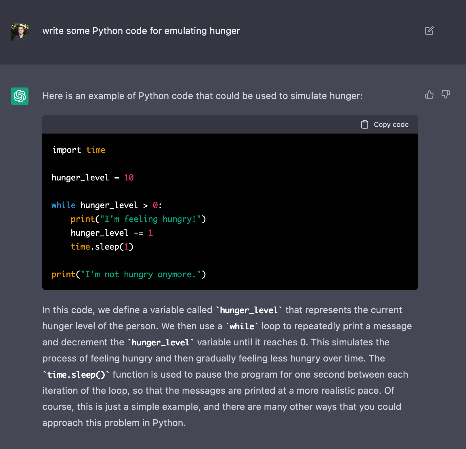
That excitement ramped up this week with the release of ChatGPT, an extremely impressive chat-based AI system leveraging the best GPT has to offer.
I decided last night to take ChatGPT for a spin, to test its code-generation capabilities. And I was astonished by the experience.
Together, we built a simulation of bugs foraging for food in a 100×100 grid world, tracking essentials like hunger and life, reproducing, and dealing with hardships involving seasonal changes, natural disasters, and predators. All graphically represented.
We’re going to explore this in detail, but I want to start off by showing you what we built:
I’ve been enjoying playing with Stable Diffusion, an AI image generator that came out this past week. It runs phenomenally on my M1 Max Macbook Pro with 64GB of RAM, taking only about 30 seconds to produce an image at standard settings.
AI image generation has been a controversial, but exciting, topic in the news as of late. I’ve been following it with interest, but thought I was still years off from being able to actually play with it on my own hardware. That all changed this week.
I’m on day two now with Stable Diffusion, having successfully installed the M1 support via a fork. And my topic to get my feet wet has been…
Chickens.
Why not.
So let’s begin our tour. I’ll provide prompts and pictures, but please not I do not have the seeds (due to a bug with seed stability in the M1 fork).
