Python offers a handy module called pprint, which has helpers for formatting and printing data in a nicely-formatted way. If you haven’t used this, you should definitely explore it!
Most people will reach for this module when using pprint.pprint() (aka pprint.pp()) or pprint.pformat(), but one under-appreciated method is pprint.saferepr(), which advertises itself as returning a string representation of an object that is safe from some recursion issues. They demonstrate this as:
>>>import pprint>>> stuff =['spam','eggs','lumberjack','knights','ni']>>> stuff.insert(0, stuff)>>> pprint.saferepr(stuff)"[<Recursion on list with id=4370731904>, 'spam', 'eggs', 'lumberjack', 'knights', 'ni']"
But actually repr() handles this specific case just fine:
Pretty minimal difference there. Is there another reason we might care about saferepr()?
Dictionary string comparisons!
saferepr() first sets up the pprint pretty-printing machinery, meaning it takes care of things like sorting keys in dictionaries.
This is great! This is really handy when writing unit tests that need to compare, say, logging of data.
See, modern versions of CPython 3 will preserve insertion order of keys into dictionaries, which can be nice but aren’t always great for comparison purposes. If you’re writing a unit test, you probably want to feel confident about the string you’re comparing against.
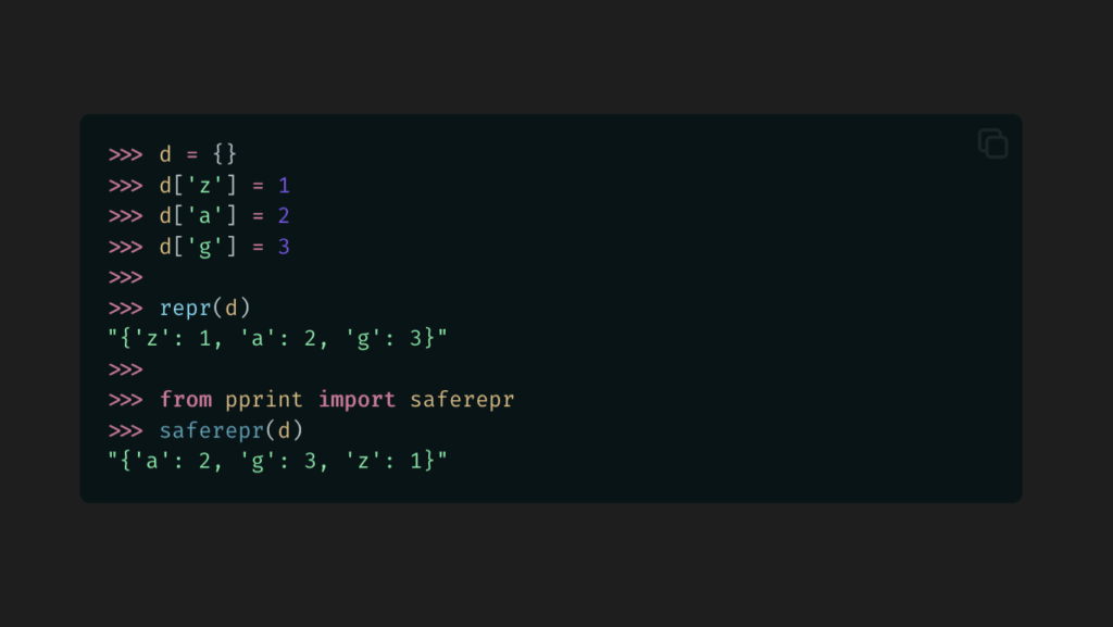
Let’s take a look at repr() vs. saferepr() with a basic dictionary.
A nice, stable order. Now we don’t have to worry about a unit test breaking on different versions or implementations or with different logic.
saferepr() will disable some of pprint()`’s typical output limitations. There’s no max dictionary depth. There’s no max line width. You just get a nice, normalized string of data for comparison purposes.
But not for sets…
Okay, it’s not perfect. Sets will still use their standard representation (which seems to be iteration order), and this might be surprising given how dictionaries are handled.
Interestingly, pprint() and pformat()will sort keys if it needs to break them across multiple lines, but otherwise, nope.
With this, you can set a style or a CSS variable based on some condition, like whether the device is on a touchscreen, or whether some CSS property is supported, or even based on an attribute on an element.
It’s really cool, and sooner or later we’ll all be (ab)using it.
Actually, you can pretty much do this today using CSS Variables, with a little understanding of how variable fallbacks work and how you can use this to make your own conditionals.
What are CSS Variables?
CSS Variables make it easy to use reuse colors and styles across a CSS codebase. At their most basic, they look like this:
CSS Variables can have fallbacks, which falls back to some other value if the variable isn’t defined. Here, the color will be black if --my-custom-fg-color wasn’t defined in the scope.
body {color:var(--my-custom-fg-color,black);}
This can be nested with other CSS variables:
body {color:var(--my-custom-fg-color,var(--my-fg-color,black));}
Fallbacks depend on whether the variable is truthy or falsy.
Truthy and Falsy Variables
When a variable is falsy, var() will use the fallback value.
When it is truthy, the fallback value won’t be used.
Normally, it’s falsy if the variable isn’t defined, and truthy if it is. But there are a couple tricks to know about:
You can make a variable falsy by setting it to the special keyword initial.
You can make a variable truthy (without expanding to a value) by making the value empty.
Let me show you what I mean:
:root {/* Empty -- Truthy and a no-op */ --no-fallback:;/* 'initial' -- Falsy, use fallback */ --use-fallback:initial;}body {background:var(--no-fallback,grey);color:var(--use-fallback,blue);}
This will result in the following CSS:
body {background:;/* No value -- ignored. */color:blue;}
Our new --use-fallback will ensure the fallback value will be used, and --no-fallback will ensure it’s never used (but won’t leave behind a value).
These are our core building blocks for conditional CSS Variables.
We can then combine these rules.
body {background:var(--no-fallback,red)var(--use-fallback,pink);color:var(--no-fallback,pink)var(--use-fallback,red);}
This will give us:
body {background:pink;color:red;}
Behold:
You can play around with it here:
Armed with this knowledge, we can now start setting CSS Variables based on other state, and trigger the conditions.
Setting Conditional Variables
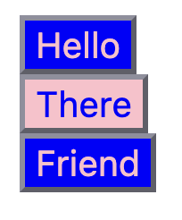
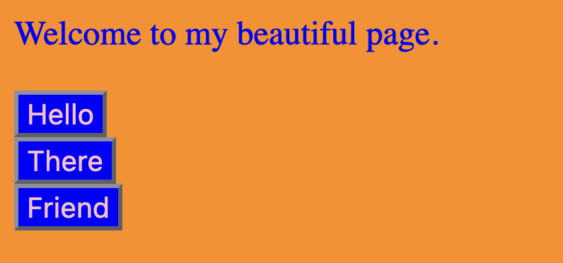
Let’s set up another contrived example. We’re going to put together some HTML with a button that styles differently based on where it’s placed. In this case, when in <main>, it will appear blue-on-pink and elsewhere it’ll appear pink-on-blue.
It’s my post and I will use hideous color palettes if I want to.
We’re going to set up some conditional state variables based on the main placement. (Yep, contrived example, but this is just for demonstration purposes.)
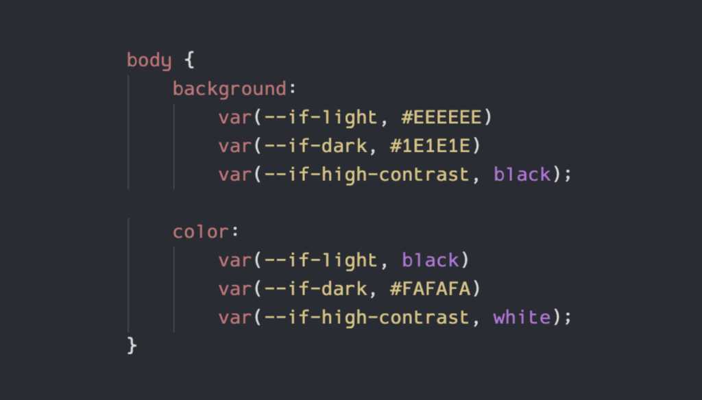
But now we can’t give users a nice toggle on the page to control their light/dark modes, so we’ll want to bring the CSS classes back with the media selectors:
Now let’s use all that to style <body> and <button>:
body {background:var(--if-light,orange)var(--if-dark,darkorange);color:var(--if-light,darkgreen)var(--if-dark,blue);}button {background:var(--if-light,pink)var(--if-dark,blue);color:var(--if-light,blue)var(--if-dark,pink);}
Look at that. So much simpler to maintain. And we can extend that too, if we want to add high-constrast mode or something.
Let’s test it.
Here it is when we switch our system to dark mode:
Far less eye strain than light. I’m sold.
Now light mode:
And system dark mode with <html class="is-light"> overriding to light mode.
And system light mode with <html class="is-dark"> overriding to dark mode.
Perfection.
You can play with that one here:
Nesting Conditionals!
That’s right, you can nest them! Let’s update our Light/Dark Mode example to make a prettier color scheme, because I’m starting to realize what we had was kind of ugly.
We’ll define new --if-pretty and --if-ugly states to go along with --if-dark and --if-light:
And now we can build some truly beautiful styling, using nested conditionals:
body {background:var(--if-pretty,var(--if-light,linear-gradient( in hsl longer hue45deg,red0100%) ) )var(--if-dark,blacklinear-gradient( in hsl longer hue45deg,rgba(255,0,0,20%) 0100%) ) ) ) var(--if-ugly, var(--if-light, orange) var(--if-dark, darkorange) );color:var(--if-pretty,var(--if-light,black)var(--if-dark,white) )var(--if-ugly,var(--if-light,darkgreen)var(--if-dark,blue) );font-size:100%;}button {background:var(--if-pretty,radial-gradient(ellipseattop,orange,transparent ),radial-gradient(ellipseatbottom,orange,transparent ) )var(--if-ugly,var(--if-light,pink)var(--if-dark,blue) );color:var(--if-pretty,black)var(--if-ugly,var(--if-light,blue)var(--if-dark,pink) );}
In standard Ugly Mode, this looks the same as before, but when we apply Pretty Mode with Light Mode, we get:
And then with Dark Mode:
I am available for design consulting work on a first-come, first-serve basis only.
Here it is so you can enjoy it yourself:
A Backport from If()
Google’s article on if() has a neat demo showing how you can style some cards based on the value of a data-status= attribute. Based on whether the value is pending, complete, or anything else, the cards will be placed in different columns and have different background and border colors.
Here’s the card:
<divclass="card"data-status="complete"> ...</div>
Here’s how you’d do that with if() (from their demo):
You can use this today in all browsers that support CSS Variables. That’s.. counts.. years worth of browsers.
It requires a bit more work to set up the variables, but the nice thing is, once you’ve done that, the rest is highly maintainable. And usage is close enough to that of if() that you can more easily transition once support is widespread.
We’ve based Ink, our (still very young) CSS component library we use for Review Board, around this conditionals pattern. It’s helped us to support light and dark modes along with the beginnings of low- and high-contrast modes and state for some components without tearing our hair out.
Give it a try, play with the demos, and see if it’s a good fit for your codebase. Begin taking advantage of what if() has to offer today, so you can more easily port tomorrow.