A Proud Moment: VMware Workstation 8
Today is kind of a career highlight for me. A moment I’m especially proud of. We just released VMware Workstation 8. Code-named “Nitrogen,” this release has been in the planning stages since around the time I joined VMware 7 years ago. It has been in active development for the past 3 years. Easily the longest development cycle we’ve had for Workstation, but also easily the best release we’ve ever done.
Previous users of Workstation will notice quite a lot of improvements to this release. We have a lot of changes, but I want to go into a few that I’ve worked on over the past three years, which I think are of particular interest.
Remoting
This is the big one.
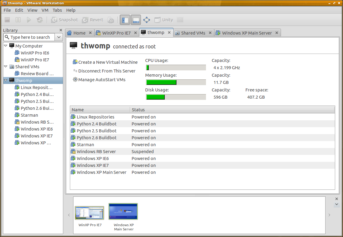
Workstation 8 can share VMs with other Workstation 8 clients. You can run a VM on one system (say, a beefy desktop machine in the back room) and access them from another (say, a light-weight laptop). All the processing happens on the machine running the VM. They can be made to start up along with the system, so you don’t even need Workstation running. You don’t even need X (on Linux).
Users of VMware Server or GSX should find this familiar. We’ve essentially succeeded the Server product with this release, with more features than Server ever had. For instance, one client can connect to multiple servers at once, alongside all your existing VMs.
That’s not all, though. You can also connect to ESXi/vSphere. As a developer, this is something I take advantage of nearly every day. I have an ESXi box running in my back room with several VMs for testing, and a couple for in-home servers. By running on ESXi, I minimize the overhead of a standard operating system, and gain a bunch of management capabilities, but previously I had to use vSphere Client to connect to it. Now I can just talk to it with Workstation.
Hear that, Linux admins? You don’t need vSphere Client running on Windows to connect to your ESXi/vSphere box anymore. That’s a big deal. (Unless you need to do some more advanced management tasks — we’re more about using the VMs, and light customization).
VM Uploading
We also make it easy to upload VMs to an ESXi/vSphere box. Connect to another server, drag a local VM onto it, and the VM will convert and upload directly to it. Super easy. Developing a VM locally and putting it up on a server as needed is just a simple drag-and-drop operation now.
No More Teams
Teams was a feature that we’ve wanted to rework for a long time. For those who aren’t familiar with them, Teams was a way to group several related VMs together (say, parts of a test server deployment) such that they could be viewed at the same time with a little live thumbnail bar. It offered some support for private virtual networks between them, with each NIC being able to simulate packet loss and different bandwidth limits.
We felt that these features shouldn’t have been made specific to “special” VMs like they were, so we tore the whole thing apart while preserving all the features.
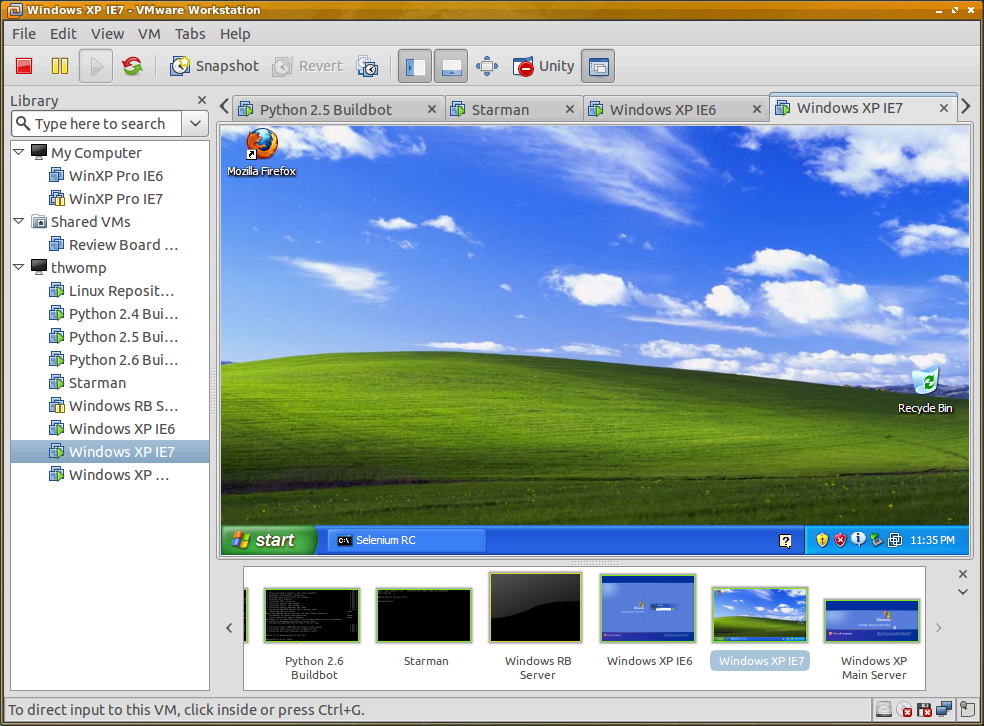
Now, every VM’s NIC can simulate packet loss and bandwidth limits. Any VMs already together in some folder or other part of the inventory can be viewed together with live thumbnails, just like Teams. Any VM on the local system can be part of any other VM’s private virtual network.
It’s much more flexible. The restrictions are gone, and we’re back to using standard VMs, not special “Team VMs.”
Inventory Improvements
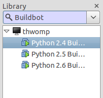
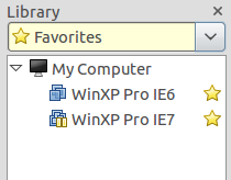
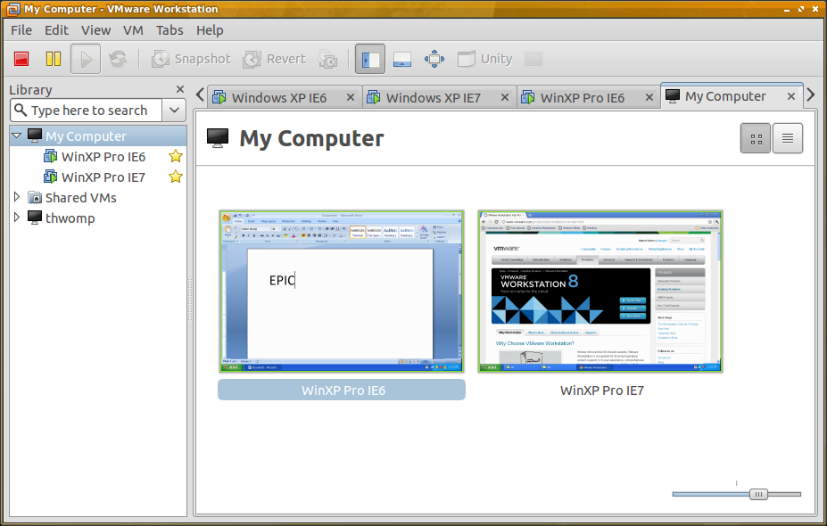
You may have noticed the search field in the inventory in my screenshots. You can now filter the listed VMs by different criteria. Show the powered on VMs, the favorites, or search for VMs. Searching will take into account their name, guest OS, or data in the Description field in the VM. The Description searching is particularly helpful, if you’re good at documenting/listing what’s in a VM that you may care about (IE6, for instance).
Favorites was reworked. It used to be that every VM in the sidebar was a “favorite.” Now we list the actual local VMs, and we don’t call them favorites. Instead, you can mark one of the listed VMs as a favorite (by clicking a little star beside it) and filter on that.
UI Improvements
We’ve streamlined the UI quite a bit. All our menus are smaller and better organized. Our summary pages are cleaner and highlights the major things you want to see.
We have new ways of navigating your VMs, which is especially handy on large servers. You now get a tab for any folder-like node in the inventory showing your VMs in either a list view (with info on power states) or a zoomable live thumbnail view showing what’s happening on each VM.
And Much More
That’s just a few of the major things. There’s many, many more things in this release, but the official release notes will cover that better than me. (Honestly, I’ve been developing and using this release for so long, it’s hard to even remember what was added!)
Tip of the Hat
A lot of great people worked on this release. The engineers that developed the various components across the company. The QA groups who have provided valuable testing to make sure this was a solid release. The product marketing and management teams who kept us going and help draft the goals of this release and market it. The doc writers who spent countless hours documenting all the things we’ve done. Upper management who allowed us to take a risk with this version. Our beta testers who went through and gave us good feedback and sanity checks. And many others who I’m sure I’m forgetting.
I said this already, but I’m so proud of this release and what we’ve accomplished. More effort went into this than you would believe, and I really think it shows.
And now that we’re done, we’re on to brainstorming the next few years of Workstation.
A Proud Moment: VMware Workstation 8 Read More »
