September 2008

Designing Unity: The Start Menu

Early on when we began to develop Unity for Workstation, we started to look at ways to give users access to the guest’s start menu. This seemed like an easy thing to solve at first. A month later we realized otherwise. We debated for some time and discussed the pros and cons of many approaches before settling on a design.

We had a number of technical and design restrictions we had to consider:

  • The UI should be roughly the same across Windows and Linux hosts.
  • Start menu contents must always be accessible regardless of the desktop environment on Linux.
  • Need to cleanly support start menus from many VMs at once.

Our chosen design

The design we settled on was to have a separate utility window for representing the start menu. This window can auto-hide and dock to any corner of the screen, or remain free-floating, and provides buttons for each VM. The buttons are color-coded to match the Unity window’s border and badge color. When you first go into Unity, the window briefly shows, indicating where it’s docked.
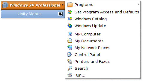
Unity Start Menu Integration

There are many advantages to this design.

  • You don’t have to re-learn how to use it between platforms or even desktop environments.
  • It’s pretty easy to get to and yet stays out of your way when you don’t need it.
  • All the start menus are easily accessible from one place.
  • The start menu buttons are color-coded to match the Unity windows.
  • Users can control whether the window is docked in a corner or free-floats on the desktop.
  • We have a lot of flexibility for feature expansion down the road.

Why not integrate with the Start Menu?

Since the first Workstation 6.5 beta, I’ve been asked why we chose the design we have instead of integrating the start menu into the notification area or into the existing Applications/Start menus. The idea to do so seems kind of obvious at first, but there are many reason we didn’t go that route.

Let’s start with the host’s Applications/Start menus. This seems the most natural place to put applications, as the user is already used to going there. We began going down this route, until we realized the problems associated:

  • On Linux, not everyone runs GNOME, KDE or another desktop environment with an applications menu supporting the .desktop spec correctly or at all. This means we’d be drastically limiting which desktop environments we could even represent applications in.
  • In the case of GNOME, it would add more clicks to get access to any application (Applications ? Virtual Machines ? VM Name ? Applications). This becomes tedious, quickly. Also, from my tests, adding entries three levels deep doesn’t always appear to work reliably across desktops.
  • In Windows, the situation is just as unclear. People tend to think that Windows only has one Start menu, but in reality, we’d have to support three (Classic, XP, and Vista). For quicker access, we’d need to add something to the root menu, and each of these start menus have slight differences in how we can do this. None of the solutions are even particularly good there, as entries may be hidden from the user to make room for other pinned applications.
  • In summary, where you go to access the start menu contents will be different not just on each OS, but across desktop environments and even different modes of the same environment (on Windows).

What about the notification area/system tray?

Another possibility that has been brought up is to use the notification area and to tie the start menu to an icon there. While this would generally work, it wouldn’t work too well.

  • On Linux, it’s frowned upon to put persistent entries in the notification area. A panel applet could work, but users would have to manually add it, and it would be GNOME or KDE-specific.
  • There’s no guarantee there even is a notification area or even a panel in Linux desktops.
  • On Windows, the icon may be automatically hidden in the system tray to make room for other icons.
  • The icon is such a small area to click on, making it annoying to launch applications quickly.
  • The icon is generally not too discoverable.

Tips and future improvements

While we’ll probably keep our current model, there are definitely improvements I’d personally like to make in some future release. One such possible example is to allow dragging an entry off onto the panel or desktop to create a shortcut/launcher. If you frequently access certain applications, you’d be able to put them wherever you want them for quick access. Clicking them while the VM is powered off would power the VM back on in the background and then run the application.

A lot of this exists already. While there is no automatic launcher creation, you can create your own that run:

vmware-unity-helper --run /path/to/vmx C:pathtoapplication parameters

This is not a supported feature at this time and may have bugs, but in the general case it should work just fine.

VMware Workstation 6.5 released!

I wanted to come up with some witty introduction here, but after a year of hard work on Workstation 6.5, I’m just too tired to come up with anything.

Workstation 6.5 is the latest release yet of our Workstation product, and continues in the fine tradition of being an awesome program. It’s also the first version to introduce Unity, a feature I’ve spent a lot of time on and will be blogging about in more detail soon.

So why should you upgrade to Workstation 6.5? Well, if you’re a Workstation 6.0 user, it’s free, which is a pretty good incentive. It also comes with a bunch of new and improved features.

Unity

Unity is a feature I’m particularly proud of, because it’s pretty much the only thing I worked on for Workstation 6.5.

Unity breaks down the walls between the host computer and the virtual machine. With the click of a button, application windows from the VM pop out onto the host desktop, allowing you to put your host and guest applications side-by-side. If you’re a Linux user but you need to use Outlook for work, this feature will let you just simply run Outlook alongside your other windows.

Unity isn’t just a Workstation feature on Linux or Windows. The free Player product can also run your VMs in Unity!

Unity works best with Windows guests right now but does support Linux guests as well. Linux guests are more experimental and I strongly recommend using a recent version of Metacity in the guest. For Linux hosts, you’ll have best results with Compiz, Metacity or KDE.

It’s a complicated feature and, while not perfect, is still pretty great. I’ve written a little about it (see Working outside the box with Unity and Workstation 6.5 Beta 1 – Now with 100% more Unity!).

In the coming weeks, I plan to write a small series of blog entries about the development of this feature, including some of the complications involved and design decisions we made.

Record/Replay

Workstation 6.0 introduced Interrupt Record and Replay, a feature enabling users to record on the CPU level everything that’s happening for a range of time in a virtual machine for later playback. This is a powerful feature for development and debugging, as one can record a session during the testing of an application and forever capture that annoying 1-in-100 crash.

Workstation 6.5 improves upon this by providing a much more flexible UI with the ability to skip around a recording, adding checkpoints for quick navigation, and just generally bringing the feature into a more mature state.

Improved Linux Installer

One of the main grumble points that users (and ourselves) have had with past Workstation for Linux releases is that the installation process wasn’t very smooth, and the vmware-config.pl script had to be re-run after any kernel upgrade.

We’ve fixed these issues by providing a new GTK-based installer that walks the user through the installation process, and by handling kernel configuration (if needed) during Workstation startup. The days of running a shell script to get Workstation running are over. Finally.

Virtual Machine Streaming

Ever want to preview a downloadable virtual machine without having to grab the entire zip file or tarball? VMs can be quite big and it’s a pain to download one only to find out that it doesn’t meet your needs.

The new VM Streaming feature gives users the ability to point Player or Workstation to a remote VM (if provided in the proper format). It will then download the bits as needed, and allow users to pause or restart the stream. It’s important to note that this will be slow at first until it has enough data to smoothly run files off the disk. When finished with the VM, the user can choose to keep what they have, or delete the cached VM from disk.

3D Acceleration with DirectX 9

Our hard-working team of 3D Code Monkeys have been working to bring support for DirectX 9 in the guest, supporting up to Shader Model 2.0. This means many more games are now playable, including one of my favorites, Portal.

Easier VM Creation

We’ve revamped the New VM wizard to provide a more streamlined VM creation process, complete with our new Easy Install feature. Simply put your installation CD in the drive or point the wizard to your ISO file and it will automatically determine the guest OS and default settings.

And lots more…

That’s just scratching the surface. We’ve made plenty of other improvements, listed in our release notes.

Some of us developers will be providing some support in the forums, and if you have a Linux Unity question, feel free to contact me directly.

Love,

Christian

Djblets and Review Board moving to jQuery

When we first began development of Review Board and its Django utility package Djblets almost two years ago, we needed to pick a JavaScript library to use. There were several good ones available at the time, and after evaluating several options we chose the Yahoo! UI Library (YUI) and YUI-Ext, an extension library to YUI. Both were excellent and have served us well over the past two years.

However, YUI-Ext itself is really no more, which means we needed to choose something new. We could have continued to bundle it and YUI with Review Board, but users of Djblets would have to hunt down a copy and load in all of YUI and YUI-Ext just to use such features as datagrids. This was, to say the least, inconvenient.

YUI-Ext and the Licensing Situation

Now I said YUI-Ext is no more, but really it’s still around, just in a new form. It had been renamed to ExtJS and became its own independent library. While compatible with YUI, most of the functionality we needed was really provided by ExtJS, meaning we didn’t really need both. Over time, YUI evolved as well, so we began looking into the differences and figuring out which to go with.

ExtJS, it turns out, was a non-starter for us. Unlike YUI-Ext before it, the ExtJS licensing terms were a bit restrictive and, frankly, confusing. Open source projects could use it under the GPL3, but commercial products required a special license per developer, which is $289 per developer. The GPL3 itself is unclear with regards to our situation. We’re an open source project, but we’re MIT-licensed. What if a company wants to modify something for their own use and not release it to the public? What if down the road someone wants to offer commercial extensions to Review Board? We’d have to choose the commercial license to be safe, but then contributors would also need to pay $289 for a license, wouldn’t they?

Looking Again at YUI

We didn’t want to step down a dangerous road with ExtJS, so we started to look again at YUI. It’s definitely come a long way and I must recommend it for developers looking for a strong toolkit with good UI support. They provide good documentation, many examples, and base functionality for nearly everything.

However, there’s a lot we’d have to rewrite to move to it, and if we had to rewrite the code anyway, I wanted to look around a bit at the current generation of JavaScript toolkits. Especially since our needs have changed over the years and we’re looking for something with a lighter footprint. We’re also moving away from the dialog-centered UI we have on some pages, which is where YUI shines.

jQuery

We ended up deciding to go with jQuery, partially because of the footprint and partially the clean way in which scripts can be written. As an experiment, I converted our Djblets datagrid code to jQuery. The result is a smaller, much more readable, reusable, cross-browser script. I was impressed by what jQuery let me do, and by the size.

I did some comparisons on the number of files downloaded and the size of the files, using the Review Board dashboard as a test.

With YUI and YUI-Ext, we were loading 7 JavaScript files, excluding our own scripts, at a total size of 376KB (when minified).

With jQuery, we loaded only 2 JavaScript files, at a total size of 128KB.

Our datagrid.js file also went down from 13KB to 9KB largely due to some of the niceties of jQuery’s API.

This is a pretty significant savings, a whole 252KB, which could be a couple of seconds on an average DSL line. And it’s not just the file size but the number of requests, which can make a big difference on a heavily accessed web server.

What This Means for Djblets

Developers using Djblets can now use datagrids without needing to do anything special. Djblets bundles jQuery, which it will use by default unless you choose to override which jQuery script is being used. This means all you need is an install of Djblets set up and you’re ready to use it!

Going Forward

We’re working on migrating the rest of Review Board to jQuery. This will take place over the next few weeks, and is one of the last major things we hope to do for our 1.0 release.

Scroll to Top